The Case for Better Designed License Plates
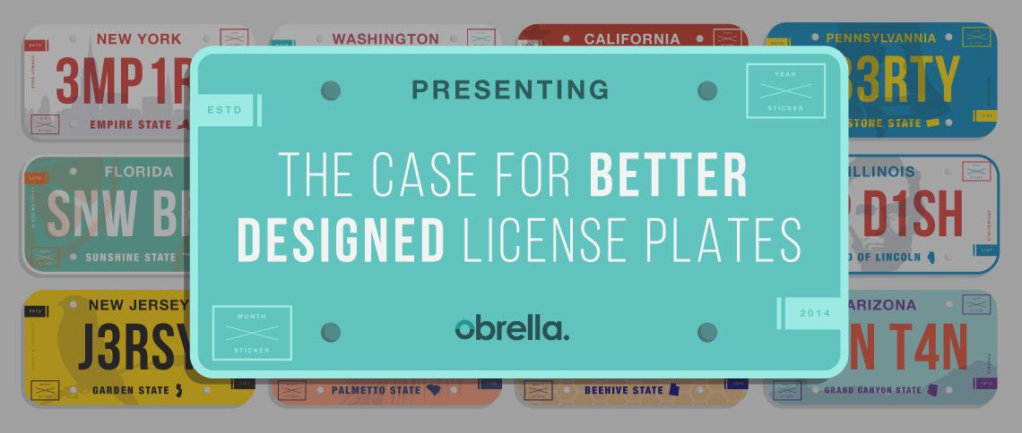
You’d have to understand my upbringing to know why license plate designs are near and dear to me. My dad started a souvenir business in 1989 that specialized in those little engraved license plate keychains that you see in airport gift shops and truck stops (you know, the ones that never had your name). For me, it meant an entire childhood of silk-screening the designs onto engravable plastic and manually cutting the sharp corners off hundreds of thousands of tiny license plates. It’s no wonder the symbols of each state — Utah’s arch, New Mexico’s Zia Sun, South Carolina’s Palmetto, Georgia’s peaches — are forever engraved in my memory.
But enough with the nostalgia. You know and I know that there are some license plate designs out there that don’t deserve to adorn the rear end of even the rustiest Ford Pinto. That’s what we want to talk about here today.
Why do we accept poor license plate design? Well because — legally — we have to. But is it also because we don’t know any better? Maybe.
“The public is more familiar with bad design than good design. It is, in effect, conditioned to prefer bad design, because that is what it lives with. The new becomes threatening, the old reassuring.” -Paul Rand, American Designer
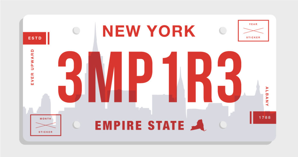
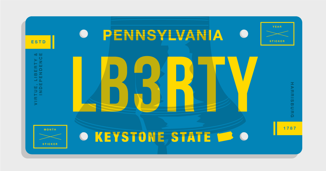
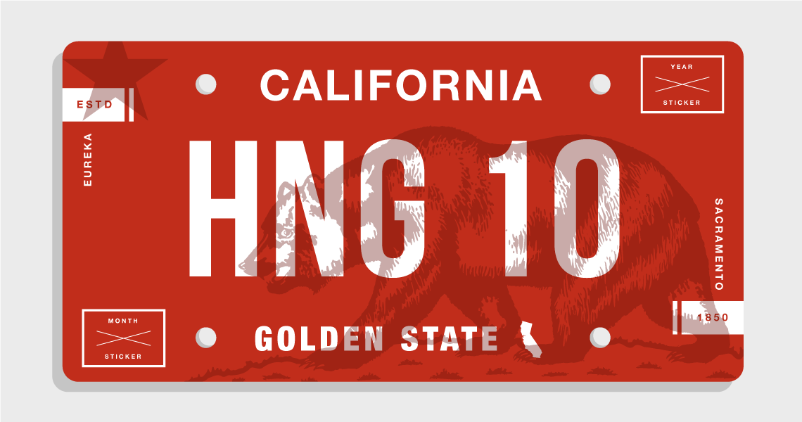
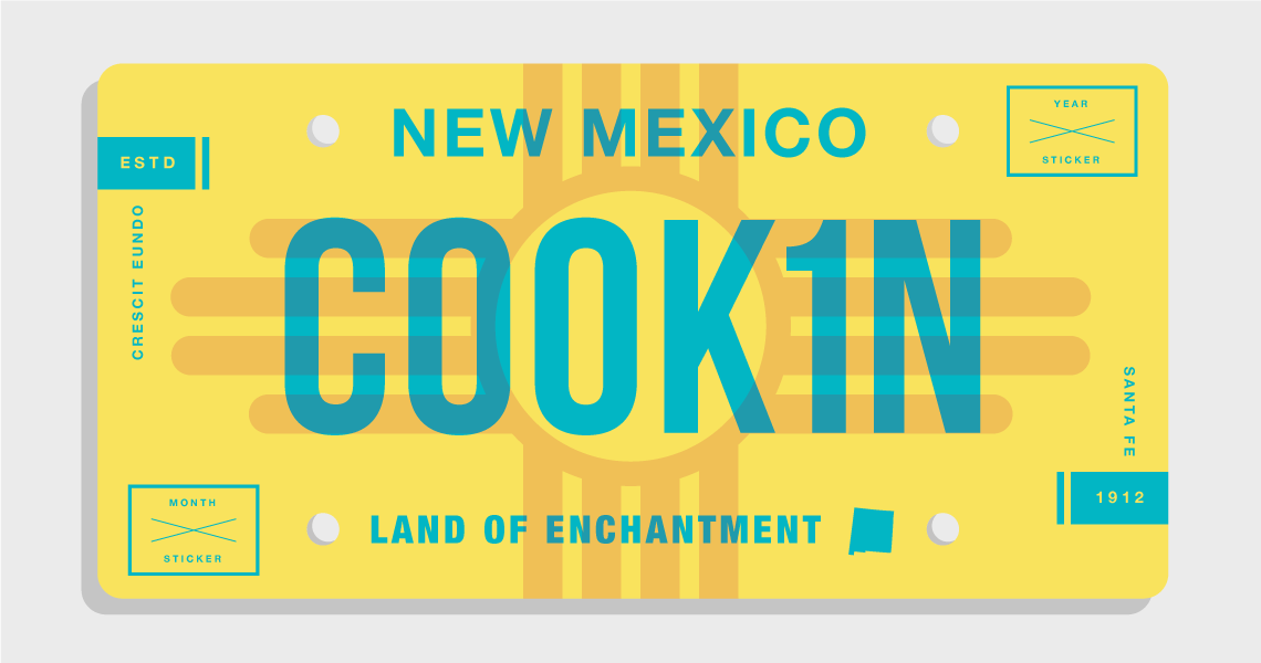
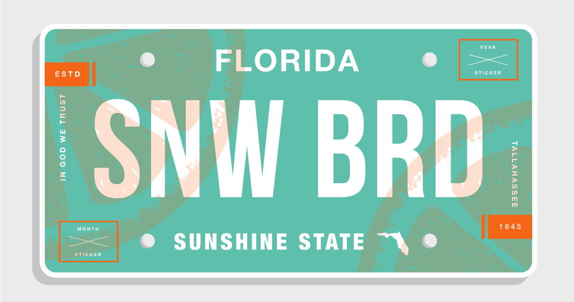
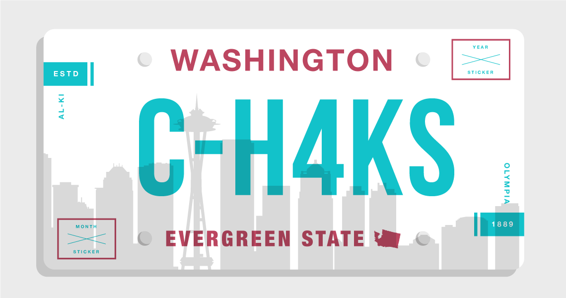
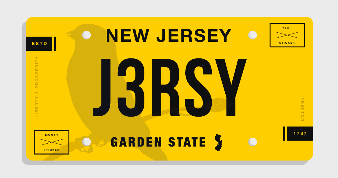
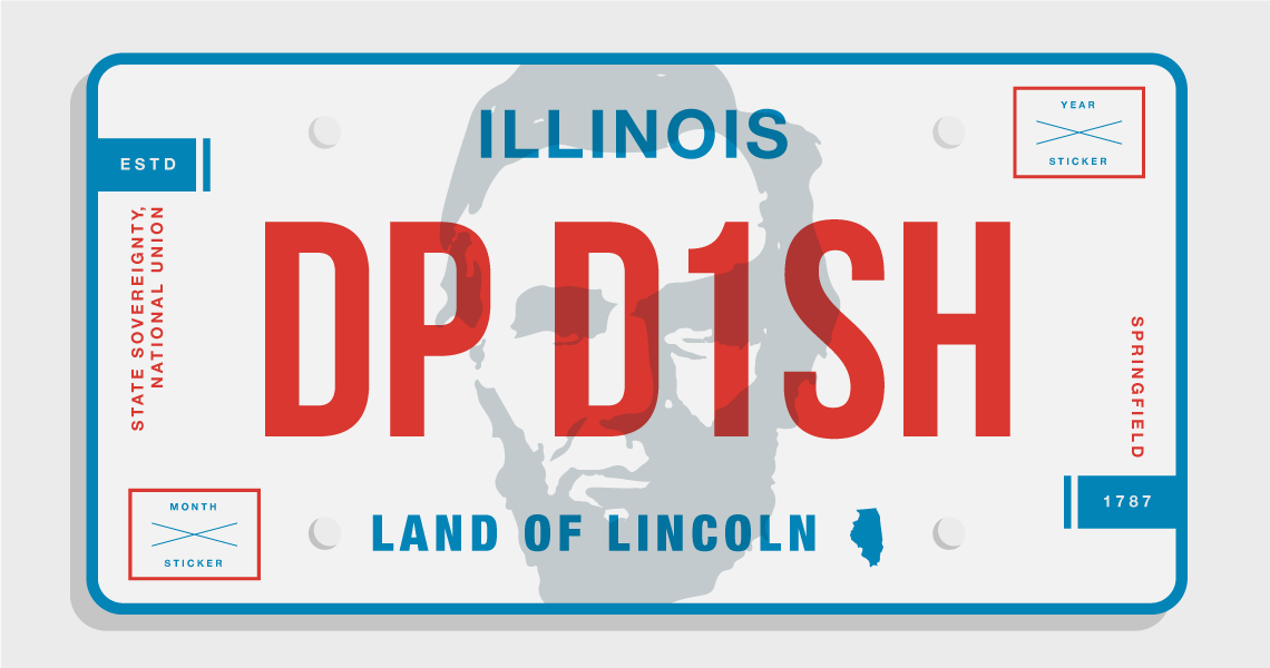
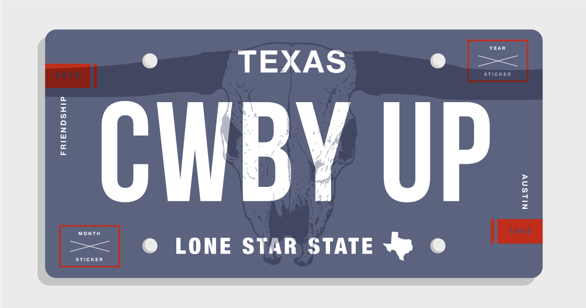
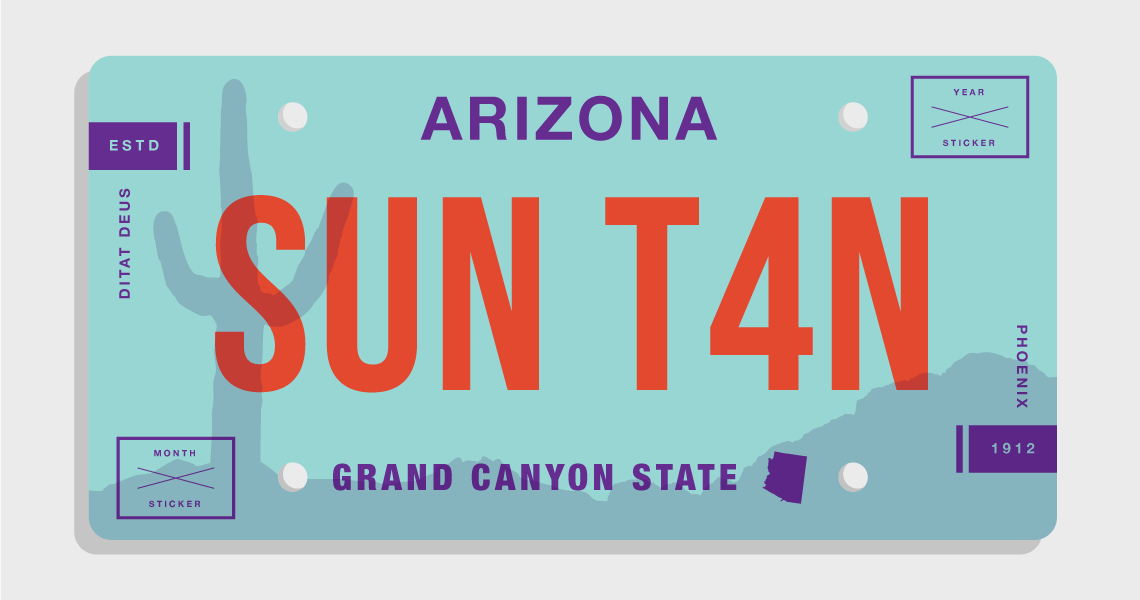
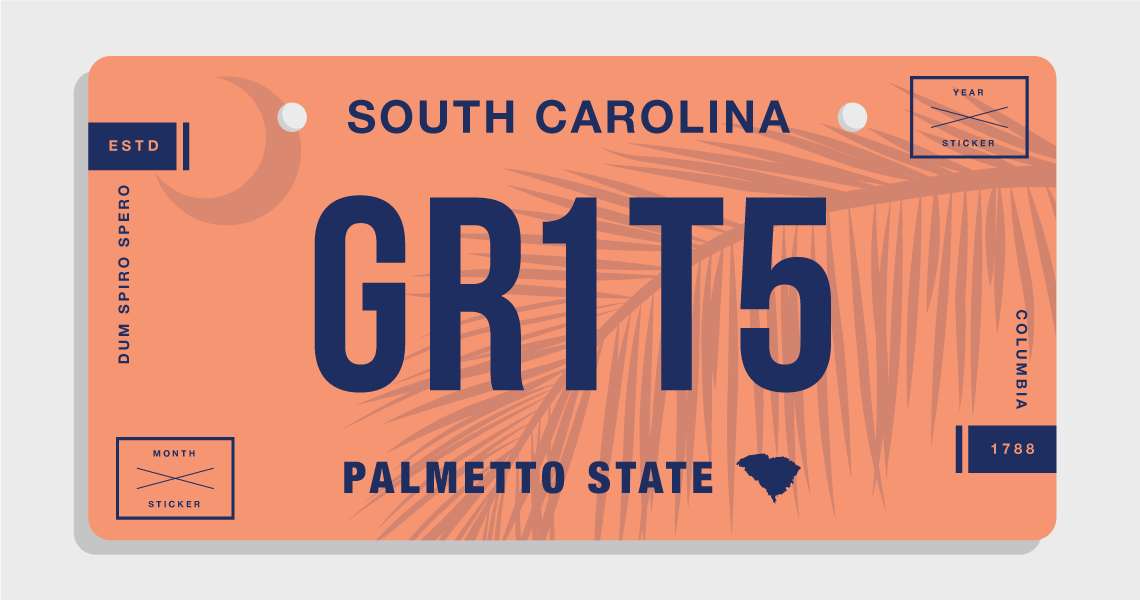
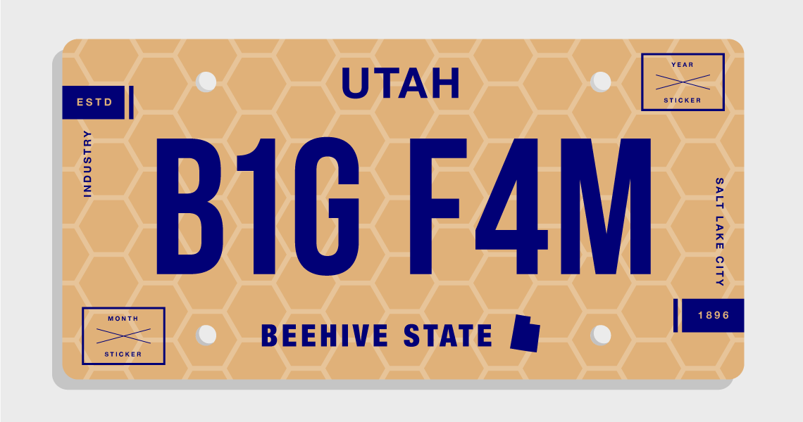
Realizing that there must be a better way, we decided to work with — the amazing Joshua Fowlke — with the task of creating a template that could work across all 50 states. There are many ways you could go about this (and we’d love to get your take on how you’d do it), but we went with a modern, flat, dichromatic approach. Staying true to the identity of each state, we used familiar colors and symbols, also incorporating state slogans and years of establishment.
Our hope is that, if nothing else, we’re able to start a conversation about the next generation of vehicle identification. If enough people get on board with the idea we can maybe — just maybe — get in front of some decision makers and pave the way for a better designed tomorrow.
Create Your Own License Plate Design
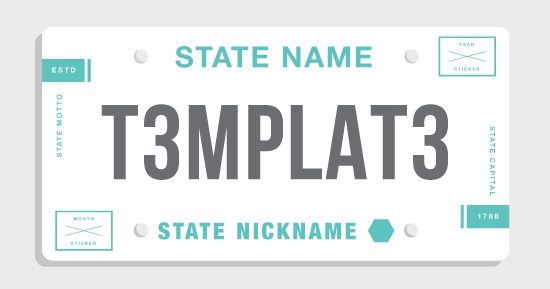
To encourage collaboration on this project, we’re making our template available to anyone who wants to try their hand creating their state’s design. Whether you use our template or not, we’d still love to see your ideas — and we’ll add our favorite submissions right here on this post. If you feel we missed the mark on designing your state, take a whack at designing it yourself. We’re still missing 38 states; if one of those is yours, we especially want to hear from you.
Click here to download the AI template. Send your submissions in .jpg format (at least 1140px wide) to press@dev.obrella.com, along with your name and a link to your twitter profile or portfolio.
These first twelve designs are from us here at Obrella. The space below is reserved for community submissions. Have fun!
1. New York
2. Pennsylvania
3. California
4. New Mexico
5. Florida
6. Washington
7. New Jersey
8. Illinois
9. Texas
10. Arizona
11. South Carolina
12. Utah

Free Insurance Comparison
Enter your zip code below to view companies that have cheap insurance rates.
Secured with SHA-256 Encryption


